Project Overview
Client: Modern Logic is a Minnesota based web and mobile app company making a web portal welcoming artists to create their first website.
Goal: They asked me to perform a UX evaluation to determine where users may drop off in the sign up process. We focused on a high fidelity prototype they created.
Owner Objectives
- Have people go through the sign up process and become a paid user without any interface roadblocks.
Competitive Advantage
- Modern Logic is targeting users who are willing to pay a bit more up front for a professional design of their navigation, photos, and text on their new website. This costs more than a free service like Google Sites or Squarespace, but significantly less than paying a web designer for a custom design.
Experience goals
- Test the usability of the portal to see if there are any barriers to getting people to sign up.
Secondary
- Test to see if users realize they can pause and continue later if they leave the portal.
- If they’re filling it out on a computer, test if are they able to add photos from their phone using the provided QR code.
Problems to Solve
After testing users for general usage, we found more significant issues.
- Users couldn't easily see how Modern Logic compares to other website providers. This led them away from the site and some said they would have instead signed up with a competitor.
- Users had issues navigating the portal when returning to add or revise content.
- The sign up portal doesn’t work on mobile. We will explore some basic interfaces here with Figma.
- The navigation needed a better indication of how far along in the process you were and what sections were not completed correctly.
My Role
- UX design and research lead
- Heuristic evaluation and usability testing
- User research interviews and synthesis
- Wireframes and basic mobile prototype
- Analysis of competitors
- Collaboration with web engineers and product owners at Modern Logic.
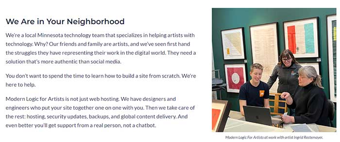
This page describing Modern Logic is accessible before signing up, but not during signing up, and could show users Modern Logic's competitive advantage so users don't leave the site.
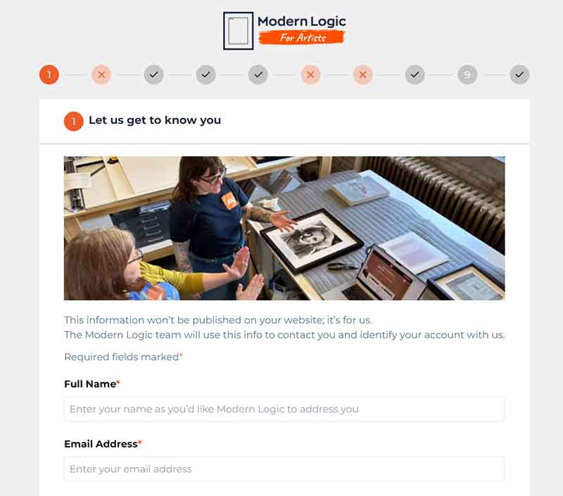
A sample of the first page of the portal.
UX Design Process
In this study I conducted a heuristic evaluation and user observations to locate any obvious interface issues or user pain points in the sign-up process.
Heuristic Evaluation
- There were several opportunities for user experience improvement upon initial testing. My findings were extensive and you can read the full report here.
- In summary, menu options, field usability, and warnings for incomplete or poorly filled forms were the biggest issues to address in making this more usable.
User Observations
I observed three users of the portal, giving them three objectives:
- create a site
- leave in the middle of creation and then navigate to a few specific pages after returning
- upload photos from their phone
Mobile Prototype Made in Figma
- A mobile prototype of the site was created to show possibilities.
User Observations
The users were art teachers or students who were not skilled in website creation but were familiar with using forms and web interfaces.
They were informed that they received a card or other advertisement promoting this site, which promises a professional website with easy setup. They were instructed to create a site by answering the questions on the portal. Later in the test, they were asked to leave the site and return, navigate to different pages to make changes, and try uploading photos to the site using their phone.
User Observation Synthesis
The major themes from user observations were:
- Competitor pricing and comparisons are missing, prompting users to search elsewhere on the web.
- Lack of cost transparency regarding better templates or customizations from Modern Logic.
- All users wanted a navigation system with labels to quickly get to their desired page.
- Users are uncertain about what their site will look like before buying it. They are also unsure about the amount of effort required to modify it, compared to using a free site like Google Sites.
- All users disliked the floating fixed menu on the more expensive modern site template.
Customer Journey Maps
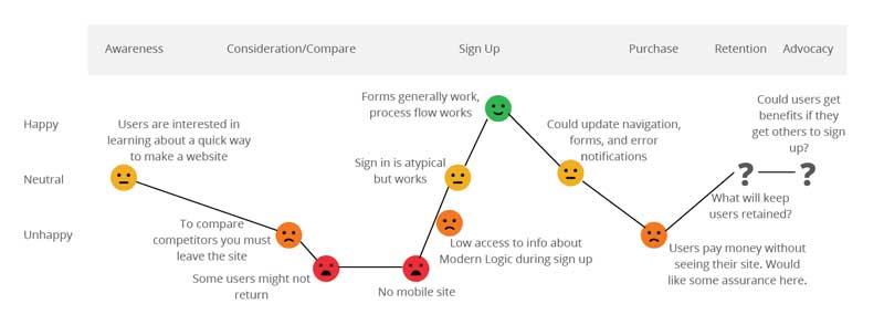
Currently the customer journey is facing challenges in the early and late stages of the process. They are conflicted about the pricing and quality of Modern Logic for Artists and how it compares to competitors. They also are hesitant to finish the purchasing process without seeing their design. They weren't sure how much back and forth they might have to adjust their design.
- Earlier placement of Website Style page: One user believed it would be more appealing to have the Website Style page earlier in the process to get users excited about their website. They suggested pushing the contact info and details to later in the process.
- Pre-start item list: Users wanted a warning about all the items needed before starting, such as text for the site, images, contact info, and social media links.
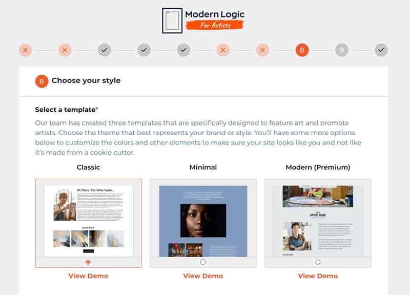
- Font choice uncertainties: On page 8, Website Style, all users were unsure about font choices and ended up selecting Times just to complete the task. Providing title and body font examples or suggested font combinations with examples could be helpful.
- Users bypassed the About page: At the landing page, all users immediately clicked "Get Started" and skipped the About Page and Templates. It would be useful to have this information available during sign-up.
- Issues with mobile image upload: When trying to upload photos using the QR code, users encountered the error message: “Application error: a client-side exception has occurred (see the browser console for more information)”
- Reluctance towards customer contact: One user disliked submitting this form and being contacted by Modern Logic to start the conversation. She preferred to control when she would be contacted.
- Hidden errors: No error messages were displayed when users left a page with errors.
- Desire for more templates: Users wanted more templates and appreciated the ability to choose colors on Squarespace, unlike the color form provided on page 8.
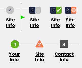
- Unclear navigation: Navigation numbers could be separated from completion status. Using green check marks could signal completion more clearly.
Alternatively, the numbers could be retained with a change in the color and shape of the icons behind them.
Additional notes from users
Mobile Portal Prototype in Figma
Link to usable prototype of mobile version of Modern Logic for Artists.
This demo shows a mobile option for the portal and what navigation might look like, including a menu for each screen, info about Modern Logic, and the option to get help by sending a Customer Care ticket.
Another big change is switching the page order of the portal so that you are designing your site first and then filling out your personal information. This gets users excited about creating their site and gets them invested in continuing sign up.
Demo of Figma board.
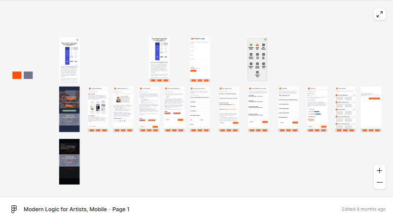
Image duplicate in case your browser can't see the Figma file.
Recommendations
- Create an explanatory video: Consider creating a video that explains the benefits and competitive edge of Modern Logic along with a brief walkthrough of the online portal.
- Accessible About Us/Info page during sign-up: Making the About Us/Info page accessible during the sign-up process will help users understand who they are signing up with.
- Analyze competition and showcase advantages: Analyze the competition, possibly offer more templates, and display competitive pricing and advantages on the Modern Logic site to prevent users from leaving to do their own research.
- During sign up, update navigation for user benefits: Updating the navigation offers many benefits to users. Refer to the list in the heuristic study for detailed suggestions..
Important
- Enhance form fields and contrast: Improve form fields and contrast, particularly to assist users with impaired vision.
- Provide error warnings: Continue to provide error warnings so users know what to fix in order to complete registration.
- User login feature: Consider implementing a user login system that allows users to stay logged in, rather than using email identification and password.
- Create a mobile version: Develop a mobile version of the site. A mockup prototype of a mobile version is available for reference..
Good to Have
Key Results
These results guide actionable changes, such as improving the portal's navigation, addressing mobile barriers, and better communicating Modern Logic's competitive value.
- Transparent Pricing and Features: By showcasing competitive advantages and pricing directly on the portal, users would be less likely to leave to research competitors.
- Improved Navigation and Error Messaging: Clearer navigation labels, status indicators, and error messages would reduce confusion and improve task completion rates.
- Enhanced Visual Guidance: Examples of font pairings and templates, along with visual previews, would make users feel more confident and excited to proceed.
- Mobile Accessibility: Developing a mobile-friendly version would expand usability and meet users' device preferences.
