The first step in evaluating Modern Logic's web portal was to put it through a heuristic evaluation. To better understand this topic I referenced the Nielson Norman Group's article 10 Usability Heuristics for User Interface Design and those items will be in bold below.
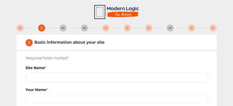
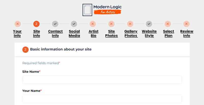
Overall, the portal has a pleasant Aesthetic and Minimalist Design, but the first issue that came up was not having easy Visibility of System Status. The first page of the portal has a numbered system at the top which looks like navigation, but was not interactive. Modern Logic quickly updated this so you could click through each page and it would show status of completion, but they could go a step further by labeling each section on the menu, allowing you to use Recognition Rather than Recall. This gives you a summary of the entire task of completing this form and allows you to quickly jump from section to section and know where you are going, giving User Control and Freedom. This is especially valuable when returning to the site if you left midway through filling out the form.
I provided section titles for them to visualize this change.

Menu on basic interactive update.

Menu with descriptive text letting a user know all the steps involved, allowing easy navigation. Underlined text reinforces the idea these are links.


